Home > Intro to Analytics
Categories: Reporting
(Last Updated On: June 15, 2022)
About This Article
The purpose of this article is to provide a comprehensive overview of Analytics.
Please note: The new version of analytics relies on a new way of tracking event data. The data set supporting the new version of analytics only reaches back to 01/2018. If you want to look at older historical data before 2018 you can add the parameter ?old to the analytics URL. The new version of the report should not be run on data prior to 01/2018 because the data needed to drive the new report does not exist for that time period. You cannot compare “old” reports to “new reports” for this timeframe (the new report simply doesn’t have data for that period).
This is how to view data prior to 2018:
https://www.snapengage.com/app/stats?old
https://www.snapengage.com/app/stats?old#reports/agent_performance_report
Our Analytics system is designed to empower you and your whole team. Whether your team is large or small, our reporting can reveal trends both positive and problematic, and help you identify your high-performing agents as well as those who need work.
Wondering what all these pretty graphs are telling you? Well, look no further!
Contents
- 1 About This Article
- 1.1 How Agent Performance stats have been improved
- 1.2 Analytics Page Layout
- 1.3 Report Descriptions
- 1.4 Overview Report
- 1.5 Hourly Contact Count Report
- 1.6 Overview Table
- 1.7 Agent Performance Report Visualizations
- 1.8 Response Report
- 1.9 Duration Report
- 1.10 Survey
- 1.11 Distributed Report
- 1.12 Binned Report
- 1.13 Hourly Report
- 1.14 Agent Table
- 1.15 Agent Availability Report
- 1.16 Visitor Information Reports
- 1.17 Pages Reports
- 1.18 Full URL
- 1.19 Entry URL
- 1.20 Referrer URL
- 1.21 Search Keywords
- 1.22 Audience
- 1.23 Bots
How Agent Performance stats have been improved
- The difference between the Agent Performance response time vs Visitor Experience wait time is that the Visitor Experience wait time is calculated from the second the visitor sends a message including waiting in the queue. While the Agent Performance response time is the time from when an agent sees a new chat pop up in Conversations Hub and responds.
- The chat total in the Overview report counts completed & active chats vs Agent Performance response time chat totals are completed chats.
- Any downloaded overview report will match overview total however, keep in mind active chats finishing up can result in those numbers not matching.
Analytics Page Layout
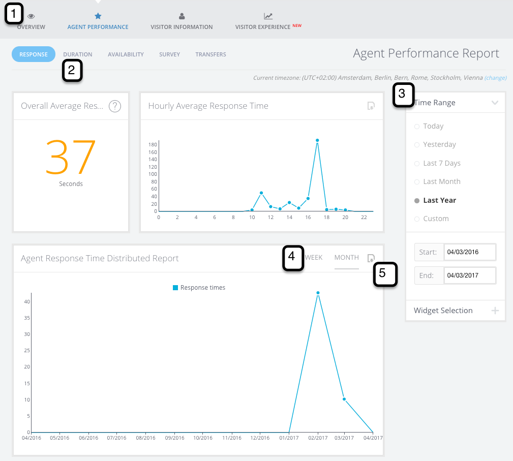
With the horizontal sub-menu (1) you can navigate between different report types. The Agent Performance and Visitor Information reports also have a sub-report menu (2). You can modify your date range, widget selection, and display types in the sidebar filters (3) depending on which reports you are looking at. Distributed reports also have a Time Frame selector (4), which lets you visualize the same data at different ranges. If you want to get your hands on the raw data, click the downloader icon (5) to get the raw CSV.
Report Descriptions
Overview Report Visualizations
Overview Report
This report will show you your accumulated Online (Live Chats) and Offline case counts for a given timeframe. It gives you an overall view on: how many chats your team is handling; how many offline contacts you tend to get; how many chats you’re missing (Not Responded chats); and the distribution of incoming proactive (automatically prompted) VS reactive (manually started) chats.
If a chat is transferred between agents, this is still counted as one chat rather than multiple on the Overview report.
Purpose: This is your eagle-eye view of chat activity. It gives you the best overall vision on: how many chats your agents are handling; how many offline contacts you tend to get; how many chats you’re missing (Not Responded chats); and the distribution of incoming proactive vs reactive chats.
Example: You can compare your “Manual Online” (or, “Reactive Chats”) against your number of “Proactive” chats like so.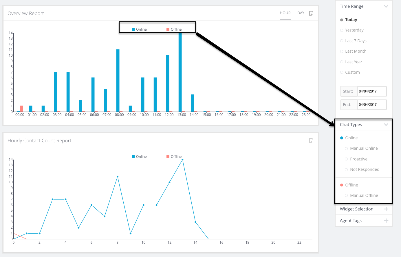
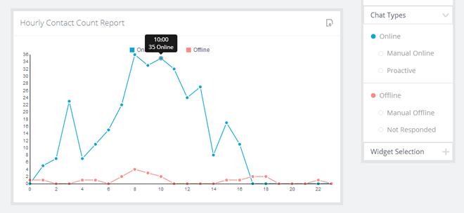
Hourly Contact Count Report
Description: This graph visualizes your aggregated contacts per hour of the day for all dates in the range.
Purpose: Chat activity can come in waves. This graph can help you discover trends in your chat activity — maybe you always see a spike in Offline and/or Not Responded cases in the middle of the day. This might indicate that you need to reschedule your agents’ breaks for example.
Example: If you are looking at one week’s worth of data, and your Chat Type filter is set to show the “Online” and “Offline” aggregated categories, the datapoint below will show you a count of all chats that week that happened between 10:00 – 10:59.
Overview Table
Description: An easy-to-read report of your chat activity during the specified time range. You can also set the Chat Types filter by clicking on types in this table.
Purpose: 1) Get a quick look at how many Proactive Chats you’re getting versus Reactive Chats. 2) Keep a close eye on your Not Responded chat numbers: you want to avoid these as much as possible!
Example: Look at a month’s worth of data on your Sales Widget to see how well your Proactive Rules are performing.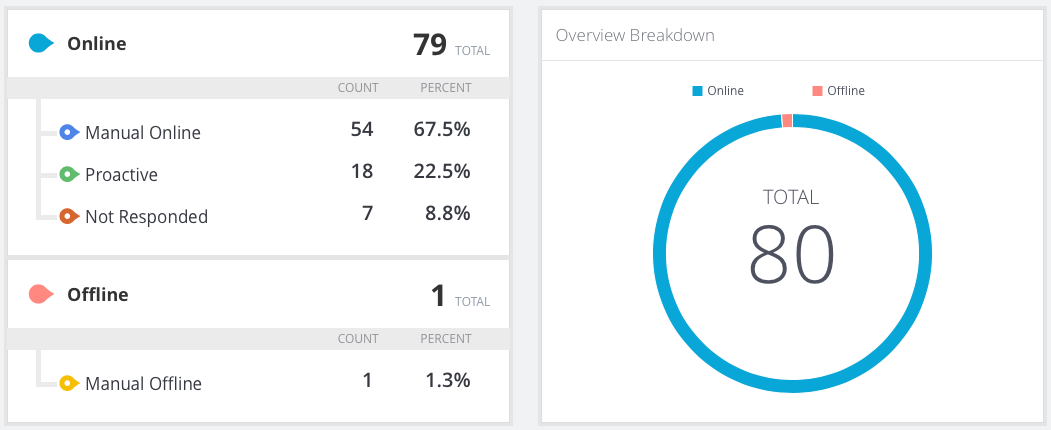
Agent Performance Report Visualizations
Response Report
This report shows the average response time per conversation. A case can have multiple conversations with different agents if transferred. Transferred chats will count for all the agents responding to the chat, whether it’s the initial response or the response to the transfer.
Not responded chats or transferred chats will not appear in this report.
For example, a visitor starts a chat. Robert responds, and after 5 minutes, transfers it to Juan. This is one chat, but it counts as two conversations, as two agents handled at different points. Because there is a transfer, this chat has two response times. The first response time is from when the chat was first assigned to Robert. The second response is from when Robert transferred to Juan.
Duration Report
This report shows the duration of conversations per agent. A case can have multiple conversations with different agents if transferred.
Transferred chats will count multiple times for each conversation the visitor had with an agent. This report will also show chats that were transferred to an agent but not responded by them.
For example, taking the situation above with Robert and Juan, this chat will have two separate durations, one per agent.
Survey
These sub-reports use the same overall template to show their respective data type — Response Times, Chat Durations, or Post-Chat Survey Scores (if enabled). Let’s take a look at the visualization types:
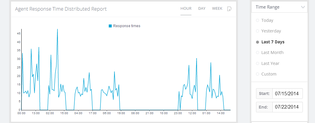
Distributed Report
Description: Much like the Distributed Overview Report, this shows you data from the entire selected date range, displayed based on the “Periodicity” selector.
Purpose: A great look at how your stats change over the course of a day, week, or month. Also serves as a QA tool to help you identify problematic times of day or days of the week, so you can improve your coverage, service, and/or response times.
Example: You could look at a week’s worth of response time data, and mouse over the high-spike data points to identify hours where you normally have poor response times. Maybe you need to reschedule that meeting to a less busy hour of the day if your response time is always spiking at that time.
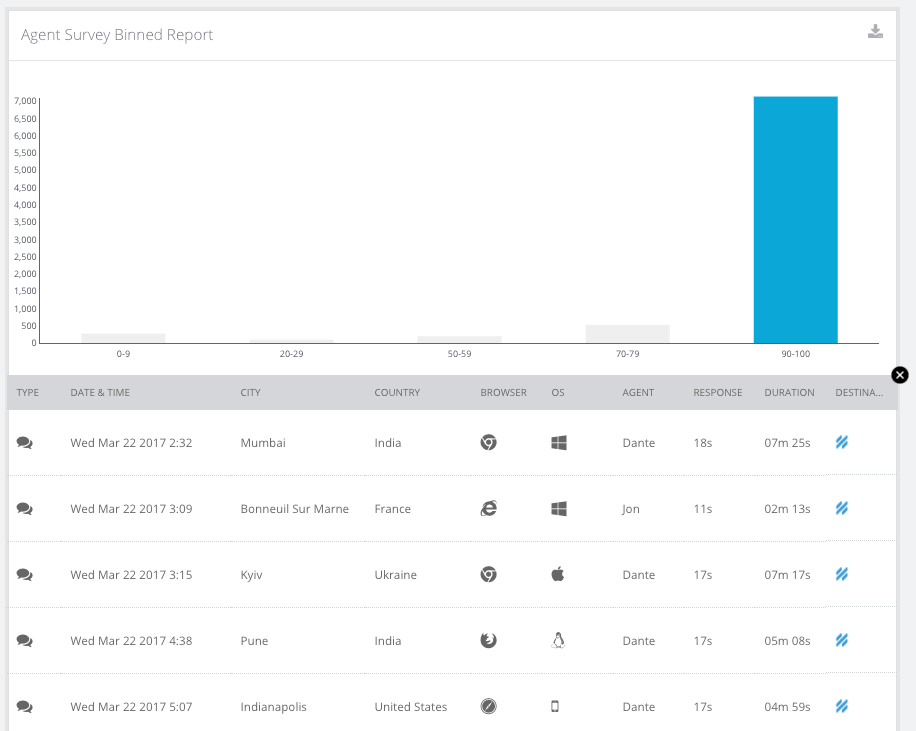
Binned Report
Description: A roll-up view of your response/duration/scores sorted into different “bins.”
Purpose: This is a fantastic QA tool. You can drill down on any of the bins in this report to find out what happened with those high response times, or long durations, or low survey scores. This could help you identify great cases to review with the team.
Example: You could view your distribution of survey scores at a glance, and drill down on a low-score bin to find out what happened in those cases.
Hourly Report
Description: Much like the Hourly graph in the Overview Report, this shows all activity within the date range aggregated per hour.
Purpose: Another graph to help you identify trends in your chat activity. Maybe your survey scores go way down just before lunch. Or maybe you find that you get a lot of short “check-in” chats first thing in the morning, and longer ones in the early afternoon.
Example: You could look over a few months of data, and select a few agents in the Agent Table to see individual trends. Mouse over any outlier points to get more details, and click on that data point to see a drilldown of all the chats contributing to the number.
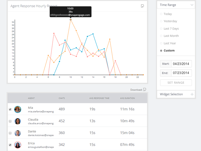
Agent Table
Description: This is a common table across the Response, Duration, and Survey sub-reports. You can see each agents’ vital stats: Number of chats, average response time, and average duration.
Purpose: The table is your best overview of individual agents’ performance and activity. You can also click on any agent to see a single agent’s data visualized in the graphs above.
Example: You could select an agent to see their individual average response time by hour in the graphs. (See above image for example.)
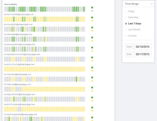
Agent Availability Report
Description: Green blocks are periods of time when a given agent was logged in and available. Yellow blocks are periods of time when an agent was logged in, but set to the “Paused” status. The white tick marks are intelligently scaled hour marks, mouse over these to orient yourself by hour. Mouse over any block to see the “From” and “To” times. The Green blocks in the “Total Availability” bar at the top represent times when at least one agent was online and set to “Available.” Notes on this report:
- An agent being “Paused” does not necessarily mean they are not handling chats — they could have still-active chats when they go from the Available to the Paused status, or they could be taking transferred chats.
- Alternatively, an agent being “Available” does not necessarily mean they are not at their maximum chat count.
- We hope to add a visualization element for active chats to this report in the future.
Purpose: This is an excellent staffing tool, since it gives you a bird’s eye view of your chat team’s availability. Note: At large date range, this data becomes unreadable, so there is a limit to the maximum time range on this report of 31 days.
Example: Look over Yesterday’s data to make sure that you always have agents available for chat during business hours.
Transfer Reports
Description: The Transfer Reports group together all of the different transfers that were made for chats within the selected widgets. The different reports show these transfers by agent, and the individual chats are shown below the table once a specific agent is selected.
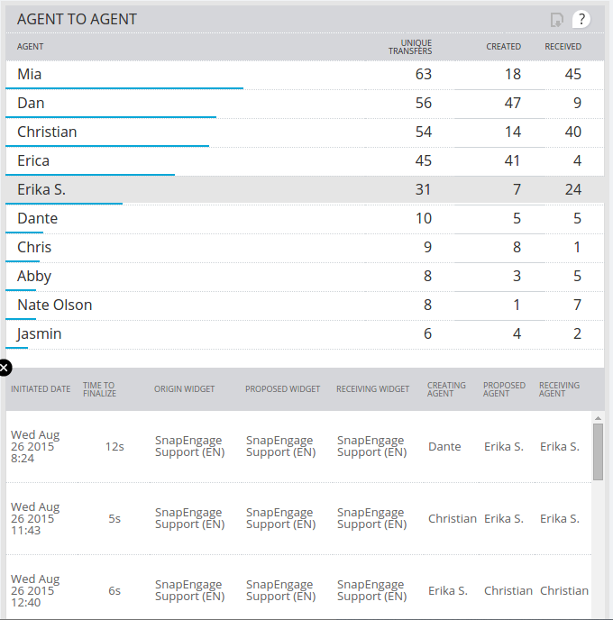
There are 4 different types of Transfer Reports;
- Widget To Widget Transfers – When an agent transfers a chat from one widget to another, that transfer will show up in this report. If an agent just transfers the chat to another widget, and keeps the chat, then that agent will be both the creator and receiver of the transfer, and the chat will be counted in the ‘Created’ and ‘Received’ column, but will only be counted once in the ‘Unique Transfers’ column. It is also possible for an agent to do a ‘Broadcast Transfer’ to another widget, in which case the creator and receiver will be two different agents.
- Agent To Agent Transfers – When an agent transfers a chat to another agent, that transfer will show up in this report. This transfer can come from either a direct transfer to a specific agent, or from a broadcast transfer to a widget in which a different agent accepted the chat.
- Failed Transfers – When a transfer is requested and either the requesting agent takes the chat back, or the chat ends before the transfer goes through, then the transfer is considered as ‘Failed’. In this table we have a ‘Proposed’ column instead of a ‘Received’ column because a failed transfer will not have been received by anyone.
- Agent Reassignments – When a chat comes in and is assigned to one agent, but then gets reassigned to another agent because the original agent did not reply to the chat, then an Agent Reassignment will show up in this report. This can happen if the original agent ends up taking the chat, but they do so after the configured “Search for another available Agent” time and in this case, the agent will be both the ‘Creating’ and ‘Receiving’ agent.
Purpose: These reports let you get an insight into how chats are being routed within your team which in turn gives you insight into both how your widgets are set up as well as how your agents are handling chats. It’s possible that you’re seeing a lot of transfers from your Sales widget to your Support widget, which might mean you should switch widgets within some of your pages. Or perhaps an agent is constantly transferring chats to another agent because they’re set up to receive proactive chats on a widget they shouldn’t be on.
Visitor Information Reports
Environment Reports
Description: These tables show you the distribution of computer Operating Systems and Browsers your incoming chatters are using.
Purpose: This can be useful data for a SaaS support team, or for your web developers. If you have a lot of visitors using older versions, for instance, you may want to invest some time into making sure your website has excellent backwards-compatibility.
Pages Reports
Full URL
Description: This is a list of the top URLs where chats were started (either Reactive or Proactive).
Purpose: If you’re interested in where your chats are starting, this could help you identify: high-performing Proactive Rules; a well-placed “Chat with us” button; or possibly pages where your customers are struggling and need assistance.
Entry URL
Description: This is the first page on your website where a visitor landed (note: a visitor who eventually starts a chat with you). Note: (none) likely indicates that the visitor has made this information inaccessible.
Purpose: This could help you identify pages that rank highly in search results, or help you figure out what your customers are looking for, or where your customers are having trouble.
Referrer URL
Description: This is the URL from which a visitor arrived on your site. Note: (none) likely indicates that the visitor came directly to your site, either through a bookmark, or through typing the URL manually.
Purpose: To help you identify good lead sources and search engine traffic. If you’re getting a lot of referrals from a given site, you may want to reach out to them for some kind of partnership. Or if you’re seeing a lot of search traffic from a given search engine, you might want to invest extra web developer time toward improving your ranking on that particular site.
Search Keywords
Description: These are the keywords used by incoming search traffic to find you. However, due to a change in the way search engines handle this information, it is now mostly inaccessible for most of the major search engines. Note: (none) means this information was either inaccessible to us, or the incoming visitor did not arrive through a search engine.
Purpose: To help you identify what your visitors are looking for when they eventually find you, so you adjust your SEO projects accordingly.
Audience
Description: Displays your visitors’ language preference settings (based on the browser’s settings).
Purpose: To help you consider and evaluate adding multilingual sales and/or support staff.
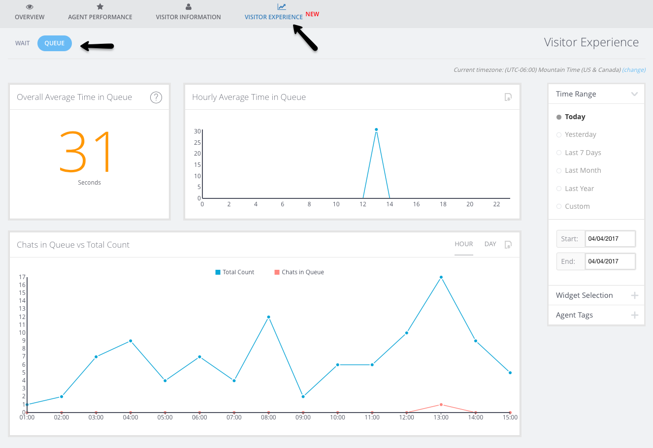
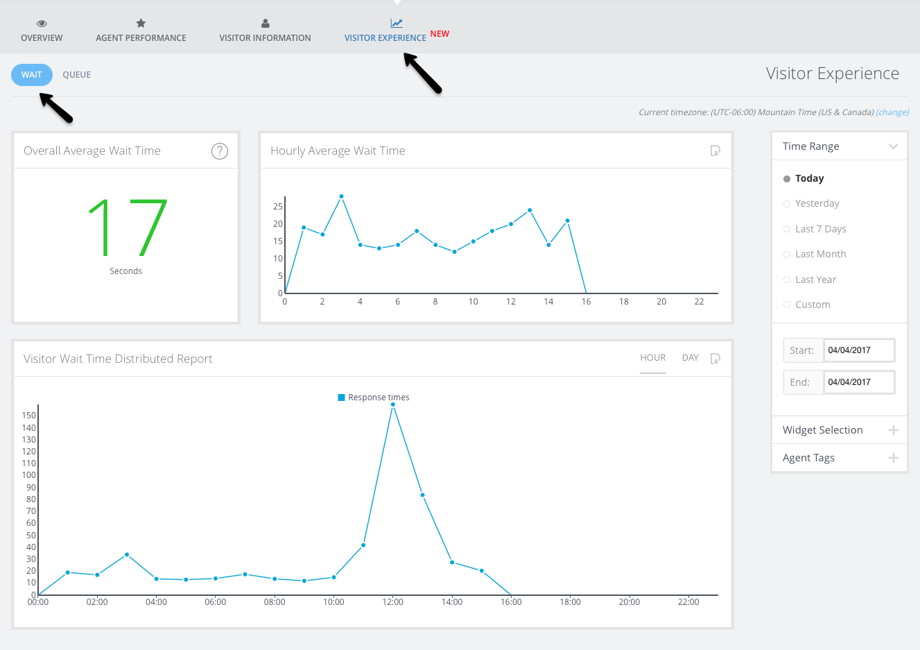
Visitor Experience
The in the all new visitor experience tab, you can check out the overall visitor wait time and time in queue.
Bots
Go to Analytics > Bots to view analytics specifically related to the Answer Bot (note that this section does not contain Guide Bot-specific analytics at this time). You can also read more about Answer Bot Analytics here.
Did you find this article helpful?

 (12 votes, average: 4.17 out of 5)
Published July 23, 2014