Home > New left side column design for the Hub
Categories: Featured Article
(Last Updated On: )
About This Article
This article explains the left side column design for the Hub.
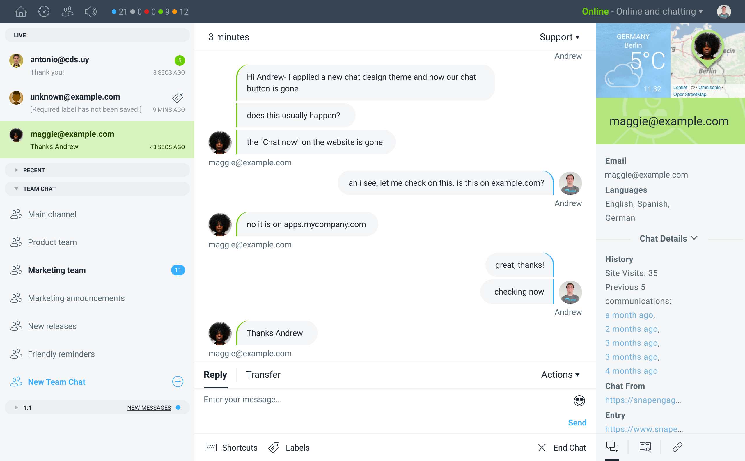
We are updating the Conversations Hub to improve the UI and usability. The main change is to the left side column where you will now find all your conversations, whether active, recent or internal in one view.
You can see a preview of the upcoming changes in the screenshot below:

- The visitor chat and team chat tabs have been combined to give a better overview of all your ongoing conversations.
- Recent chats and team chats occupy only one row in the overview which can be retracted or expanded, the ongoing live chats will still have two lines to preview the last sent message.
- A new background color in the light mode sets the column visually apart from the chat transcript area.
- Unread chats scrolled out of view have a new notification option.
- The UI to start new team or 1:1 chats has been improved.
Feel free to contact us with your feedback or contact us at [email protected] or on chat at snapengage.com
Published July 16, 2019
