Home > SnapEngage ADA Accessibility
Categories: Security | Design Studio
(Last Updated On: )
About This Article
The purpose of this article is to provide a comprehensive overview of how SnapEngage is ADA accessible.
SnapEngage ADA Accessibility
This document describes how we’ve built SnapEngage to be accessible, and steps you can take to ensure your use of SnapEngage supports accessibility.
Whether you are providing sales assistance, customer service or technical support, you want that service to be available and high-quality for all of your customers, including those who have disabilities. The SnapEngage visitor experience (what your customers experience when they are chatting) has been designed to follow Web Content Accessibility Guidelines (WCAG) 2.1 Level AA.
Here are some of the key ways in which our visitor chat experience is made accessible to everyone:
- Keyboard navigation: all aspects of chat and the chat menus can be accessed using a keyboard without requiring a mouse or trackpad.
- Color contrast: all text in the chatbox is clearly visible.
-
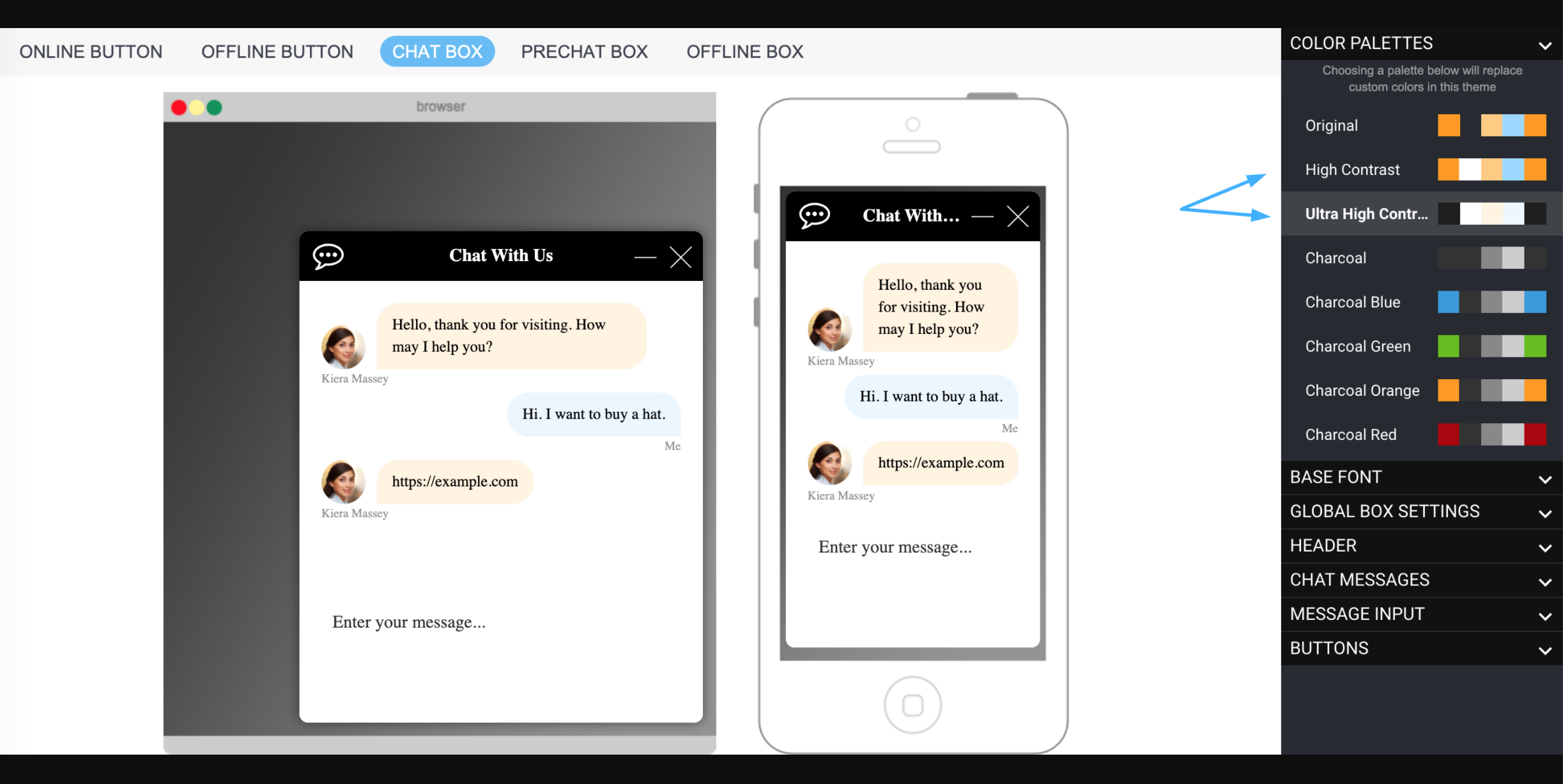
- We have also created a high-contrast and ultra-high-contrast color palette in the Design Studio which you can use or modify to create a branded, compliant version. This is available when you edit a design, clone, or create a new one.
- Bots, File Uploads, Payments: our enhanced chat functionality makes our chat more accessible.
- Set of rules / tests in place to ensure new features are also accessible going forward.
How to ensure chat is accessible
We have made best efforts to follow all Web Content Accessibility Guidelines (WCAG) 2.1 Level AA. However, keep in mind that you (as a SnapEngage administrator) can modify your chat design settings and possibly create a non-compliant design. Therefore, please follow these steps to adhere to accessibility guidelines for your visitors.
- Consider using one of our high-contrast palettes available to you in Design Studio.
- Most importantly, you will want to:
- Maintain a large, clear font (also available in the Design Studio).
- Maintain a high color contrast. Use a tool like this one to verify a 5:1 or greater contrast ratio.
Did you find this article helpful?

 (10 votes, average: 3.20 out of 5)
Published June 4, 2020