Home > Capacity Report
Categories: Reporting
(Last Updated On: )
About This Article
The purpose of this article is to provide a comprehensive overview of the capacity report.
The Capacity Report
The Capacity Report is currently available on Professional plans or higher.
You may have noticed a recent addition to your SnapEngage Analytics tab, which is our new Capacity report tab. This new feature allows admins to gain insight on those peak times when visitors chatting in have caused agents taking chats to be maxed or near maxed on the total number of chats they can take at once. The Capacity report will display to admins the total capacity for your chat team for the selected widget. What this means is if you had a team of 4 agents online and “available” in Conversations Hub (each with a max capacity of 3 chat spots they can take at once) your total capacity would be 12 at that given moment in the day.
The Capacity Report features of combination of datasets to indicate team capacity. The 15 minute intervals are broken down based on the number of days selected, and is an average. So for example, if you select one day, it will be an average over that 15 minute interval. However, if you select 10 days, it will add the stats for the 10 days, and then divide it by 10, to get the average over the 15 minute interval.
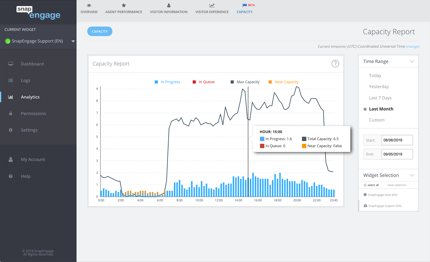
The team capacity for a widget is indicated on the y axis of the graph seen in this tab , as seen here:
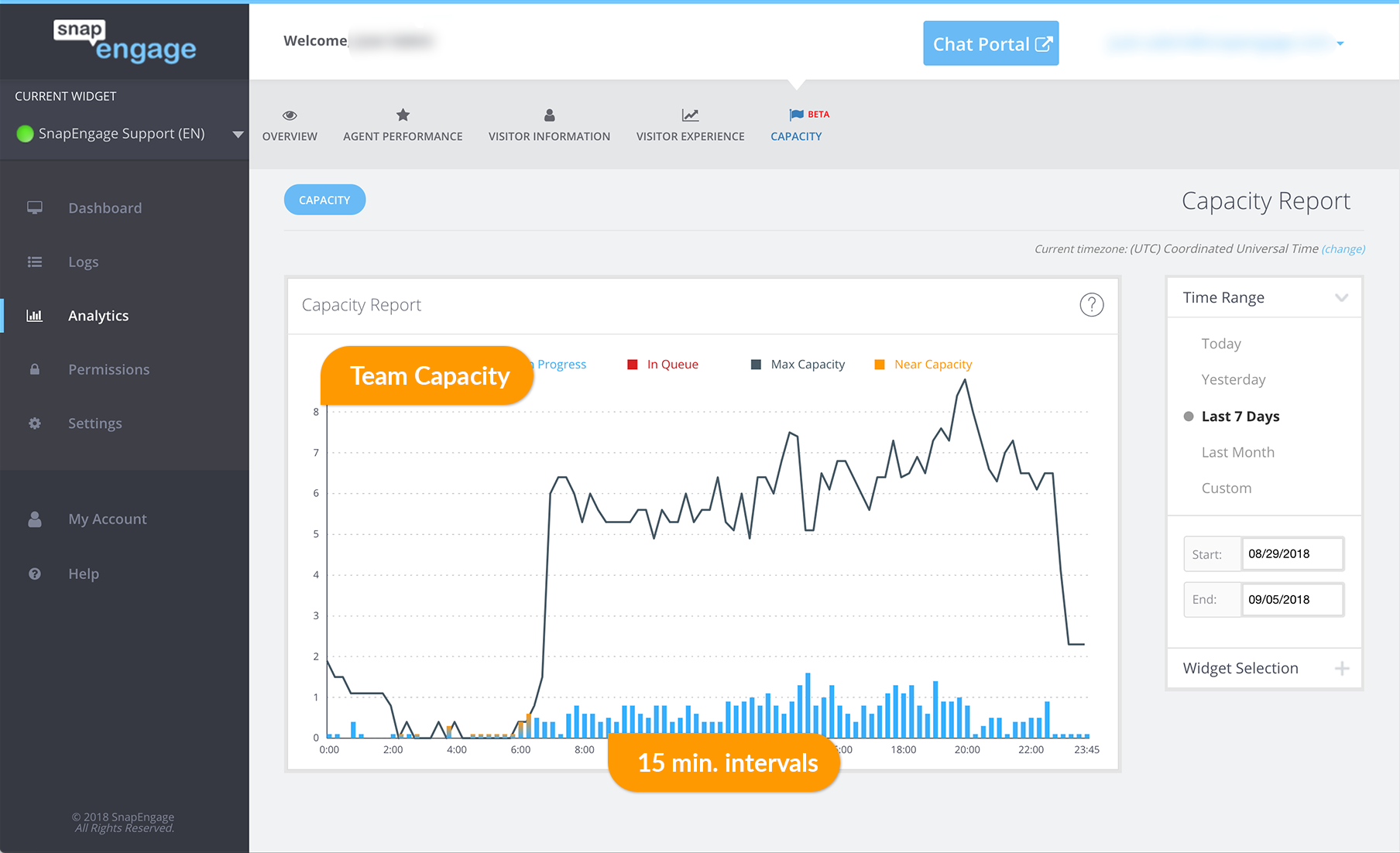
The x axis represents time of day and is broken down into 15 minute intervals when examining this report. Hovering over a given time of day with your mouse will give you a snapshot and break down the following:
- Number of chats in progress (indicated in blue)
- Chats in queue (indicated in red)
- Total capacity (indicated by the grey line)
- Near capacity (indicated in orange)
Note: Near capacity will also show whether you were near capacity or not, which is indicated by a true or false. Here is an example of all of this:
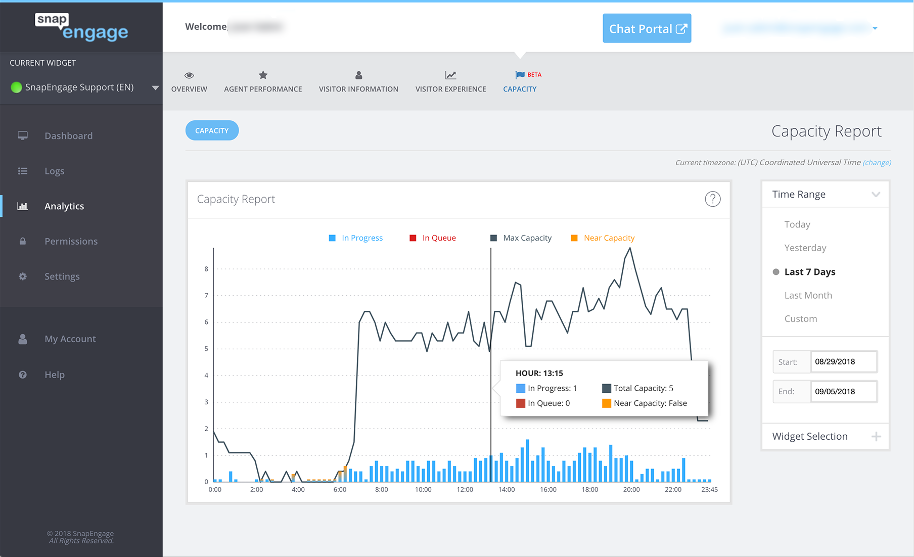
As you can see from the example above when hovering over 13:15 there was 1 chat in progress, the max capacity of the team is 5, which is why the near capacity is false since only 1 chat was in progress out of 5 possible spots for the team.
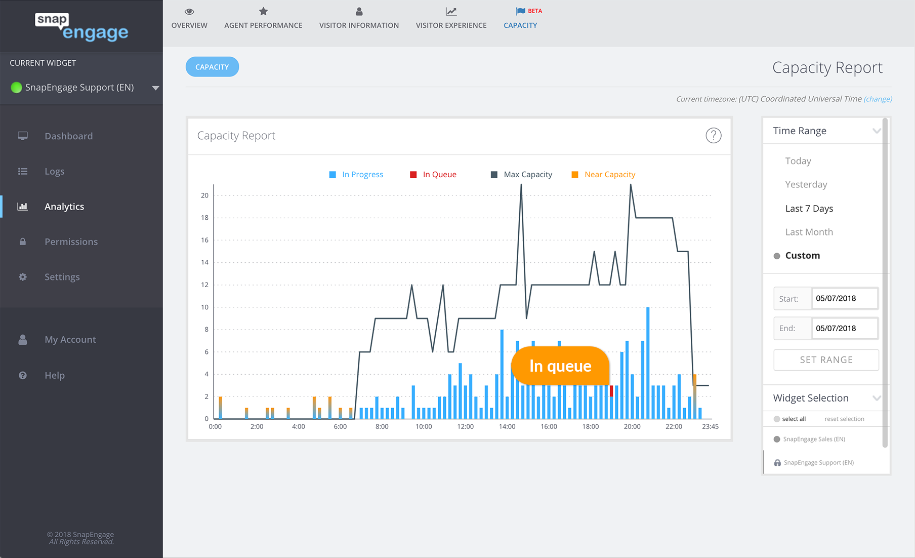
Whenever you have queued chats will be shown in red like in this example:
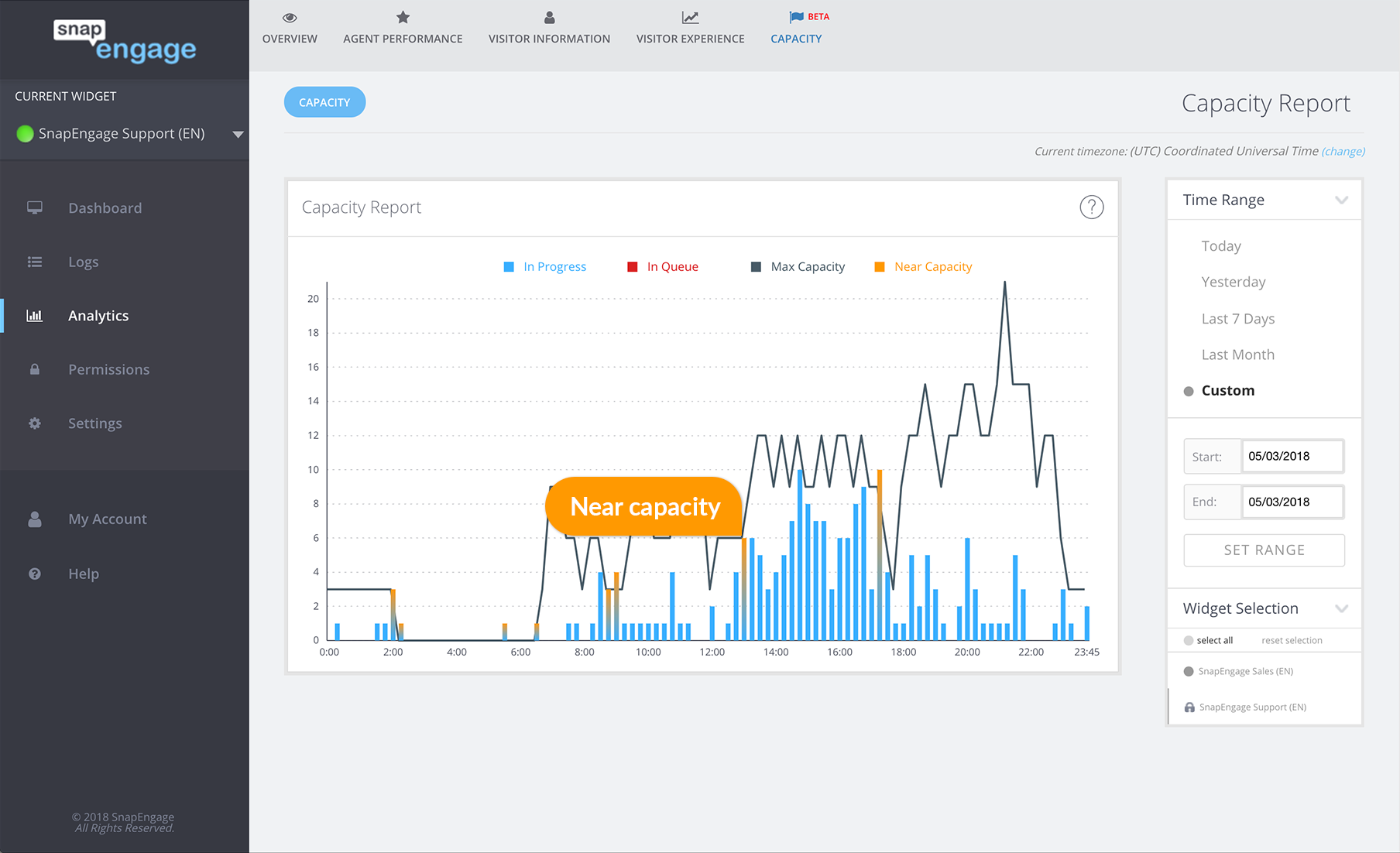
If the team was near capacity it may look like this:
As you can see, as an admin this is a very helpful tool for gaining insight into busy times of the day for your chat team, so you can schedule breaks and lunches appropriately for agents.
**Note: If you are viewing data in the Capacity report for more than 1 day (ie Last month) or something aside from yesterday or today (single days) you may see decimals. Not to worry this is due to the fact you are viewing more than one day and the capacity report calculations are an average. So using the example above you may see something like the following.
What does that all mean you might be asking ? What the report is showing you is that during that given moment of the day (The Capacity report works in 15 min increments ) You averaged 5.6 chats and 0.6 of those chats ended up in Queue. How did it calculate 0.6 for Queue you might be asking yourself ? and still show a Near Capacity: False ? It’s likely that you had a few chats go into Queue on a few of those days you selected for Date Range at that time period of the day but overall what it’s indicating that you’re pretty well staffed and not Near Capacity during that time of day for the date range selected. As mentioned above it is normal to have decimals, all averages can show decimals except for today and yesterday since those are 1 day periods (or if you use custom single day). The other thing worth mentioning is that this can be viewed on either a per-widget basis or can be viewed across multiple, selected widgets.. Hope this help you in staffing your teams appropriately during the day !
Did you find this article helpful?
 (3 votes, average: 5.00 out of 5)
Published September 28, 2017