Home > How to: Use the Design Studio
Categories: Design Studio | Featured Article
(Last Updated On: )
About This Article
This article explains how to use the design studio. The Design Studio is a powerful tool that will allow you to create your own chatbox, pre-chat form, and offline form, in addition to the online and offline buttons with separate settings.
Design Studio!
The Design Studio is a powerful tool that will allow you to create your own chatbox, pre-chat form, and offline form, in addition to the online and offline buttons with separate settings.
Note: the minimized button is preset by us and can not be changed at this time.
You will also be able to choose which fields you can have your pre-chat or offline form, whether you want the fields to be required or not… we give you TOTAL FREEDOM to have your chat looking the way you want it to look. You want your chatbox to have a neon purple color? Hey, we don’t judge, go for it! As long as you don’t blame us when your marketing department chases you to tell you the 90’s are over.
Now, how does this design tool work, you say. Well, let’s have a look.
Click on Settings – Design Studio to get started.
Click on Add Theme or Clone the existing design to get started :
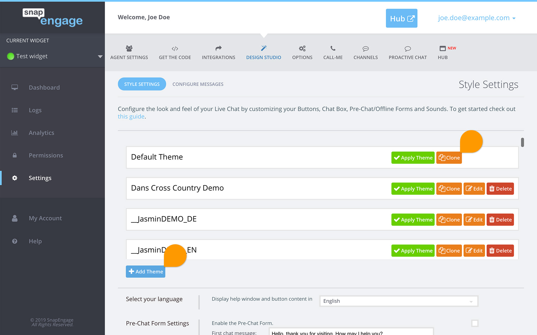
This will take you to the main menu which will show you how the design will look on a browser (left) and on a mobile device (right)
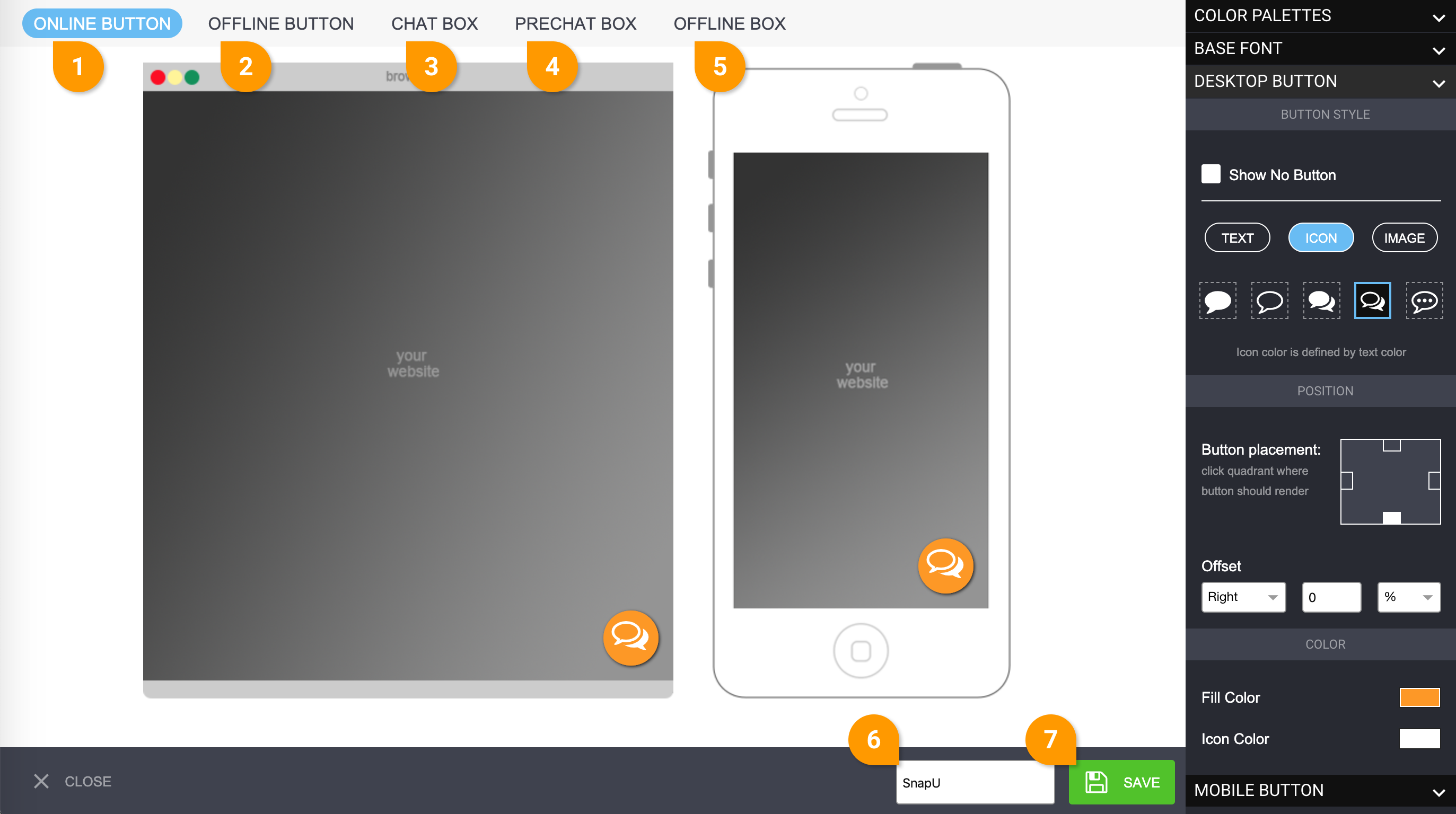
So, this is what you will see first :
- Online button – This will allow you to design what we currently call the “chat button”
- Offline button – This will allow you to design the offline button
- Chat box – This is the chatbox, what the visitors see when they speak to you
- Pre-chat box – If this is enabled, this is where visitors are asked their email, name, etc… before starting a chat
- Offline box – This is what visitors will see when you are offline, and they will send an email through this
- The name of your design
- Don’t forget to save!
———————————————————————————————————————————————|
THE ONLINE & OFFLINE BUTTONS
Create your online and offline buttons. From the menu on the right, you will be able to :
Select the font

Make all changes for both buttons or desktop only (see mobile)
You will be able to choose between :
TEXT (such as “Chat”), where you will also be able to show borders, choose color, add width of the borders, and round the corners.
ICON : Here, we give you 5 different options to choose from, you will also be able to choose the color.
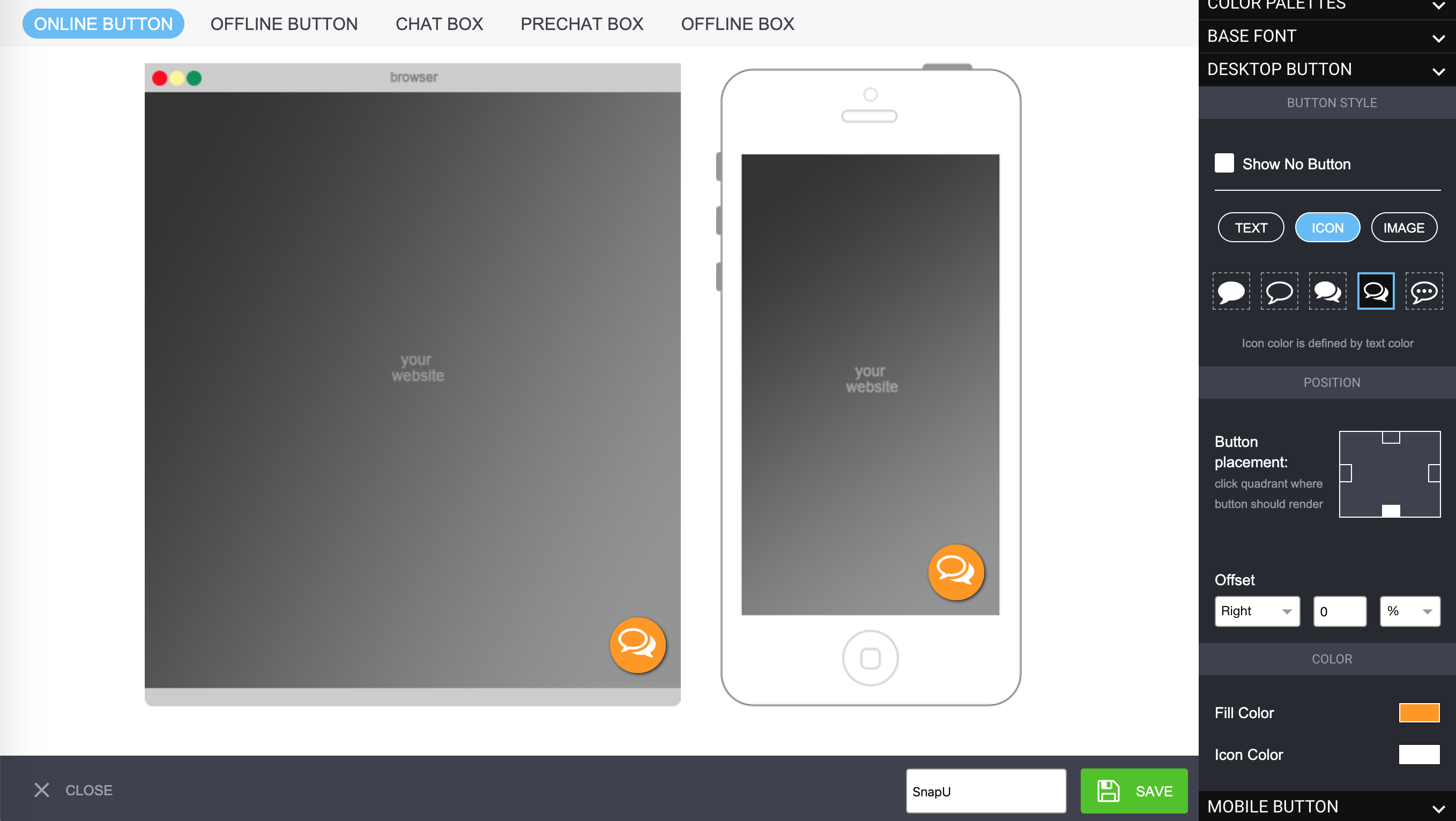
IMAGE : You want to create your own icon? Go for it! The width and height will be set automatically. We offer the option to adjust the width and height so you can upload an image in 2x the resolution so it looks great on retina screens.
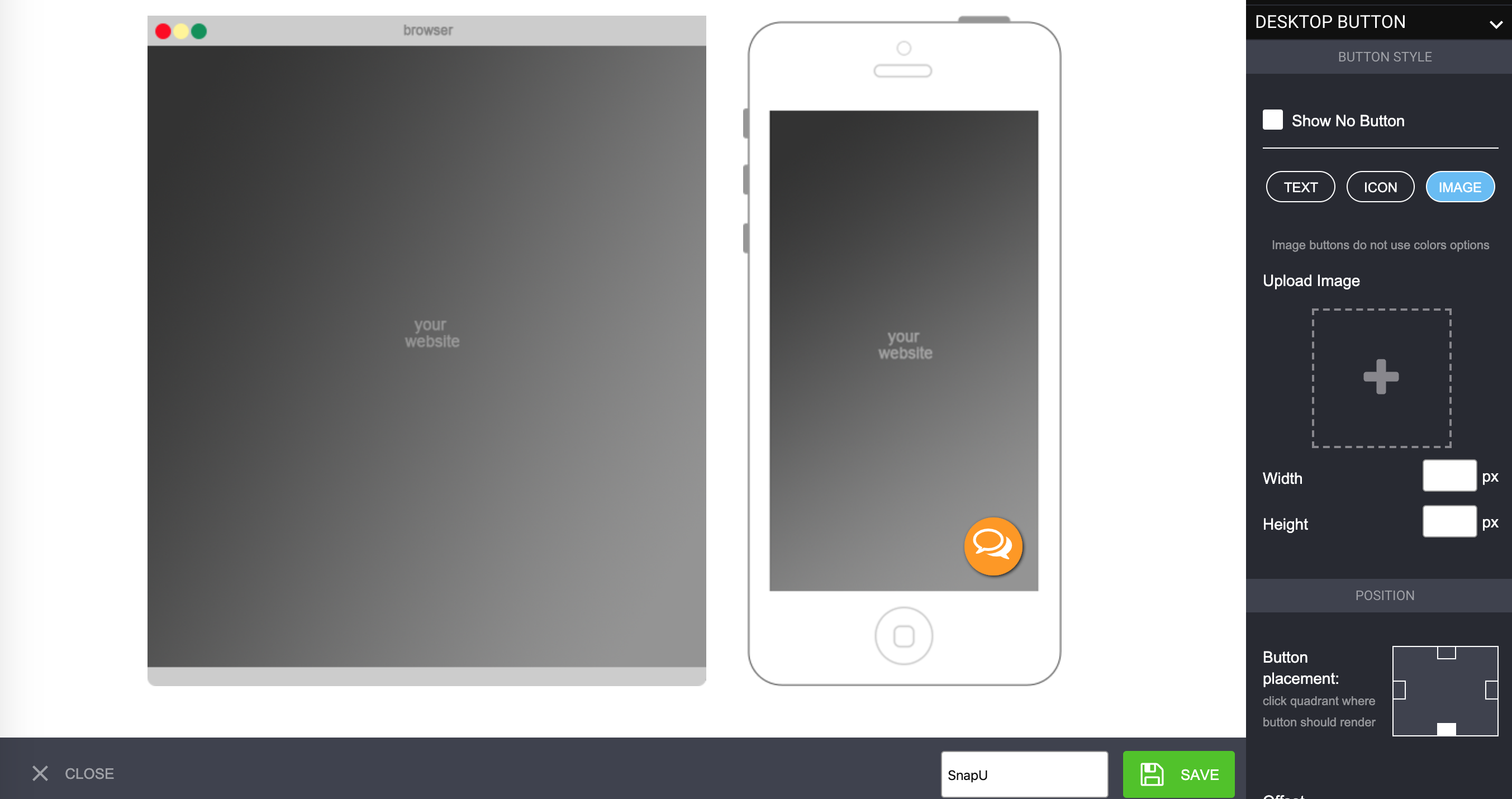
We do this on our help site here we have loaded an image of a rotating gif along with a button our designer created. Additionally, For the online button there’s no resizing or conversion that takes place when it’s uploaded via the Design Studio. Note: this is different for agent avatar photos (agent photos ) images which you can read about here if needed for refrence.
Choose the position of the button
This defines where your button will show.

Choose left, right, top or bottom, and then select how far you want it from there.
Make all changes for mobile
By default, whatever you choose for desktop, will also be applied for mobile, however, if you would like different settings to be applied for mobile, you can do so. Click on the Mobile button section (1) and untick the Use desktop styles checkbox (2).
The same settings will now show for mobile, and will only be applied for mobile devices. You can choose to hide the button for online, offline and for mobile and desktop for each of those buttons.

———————————————————————————————————————————————|
THE CHAT BOX
Now, let’s get on with the chat box design!
Color Palette
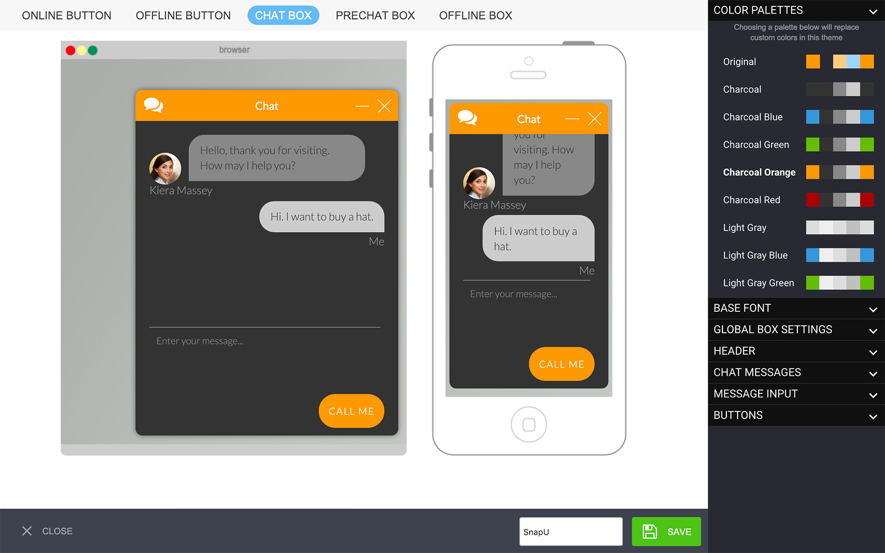
Do you want to add a color palette that applies a color theme to the whole design (chatbox, pre-chat form and offline form)? Go for it! Simply click on color palette, and select one of the many themes we offer, and a whole theme will be applied.
Font
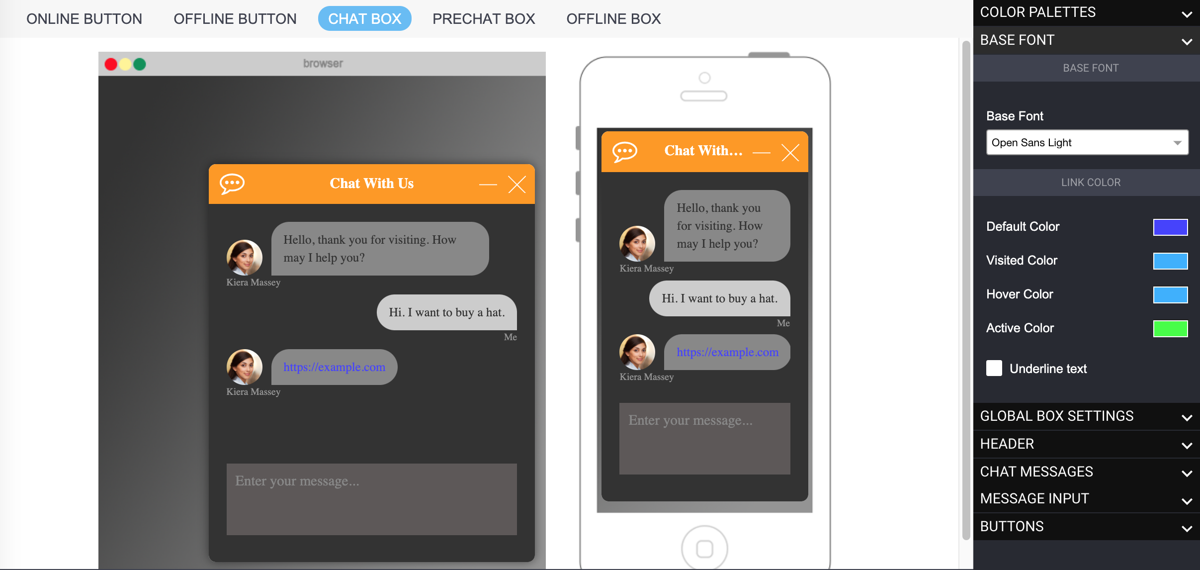
This is where you select the font, which applies to the design globally.
You can also change the color of the hyperlinks sent during the chat. For this, you have four options :
1 – Default color : The color the link is displayed in when sent by either the agent or the visitor
2 – Visited color : If the visitor has visited that page before, it will show in that color.
3 – Hover color : When the visitor hovers over the link, it will be displayed in that color.
4 – Active color : As the visitor clicks on the link, it will be shown in the color.
Global Box Settings
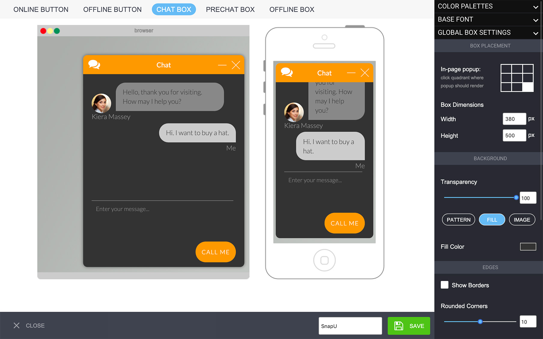
The Global Box settings will let you choose the dimensions of the chat box, its position in relation to the screen, it will let you fill the background color, add borders if you wish to do so, round the corners and remove the SnapEngage logo (this last option will be available on Professional plans or above only).
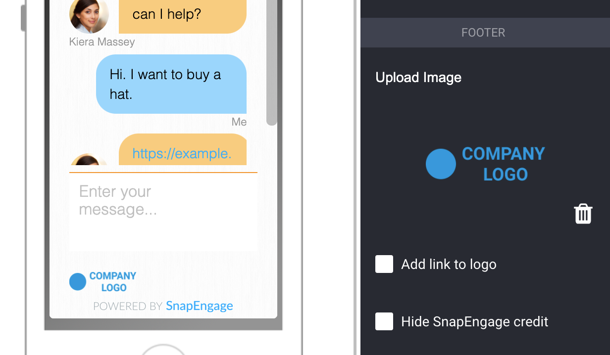
You can also add your own company logo to fit your branding (this is also available only on Professional and Enterprise plans). Studies have shown that having elements on your site which fit your branding can build trust in customers, so adding your logo can be beneficial. This will be added to the bottom left corner of your chat box. This is a fixed position.
Enterprise users have the additional option to add a link to the logo. If a visitor clicks the link, you can define a redirection link that the visitor will be directed towards. You can do this by checking the box underneath your logo to “Add link to logo” to support a variety of marketing/sales and customer service scenarios.
You can also add a background onto the chatbox, check this article out.
Header
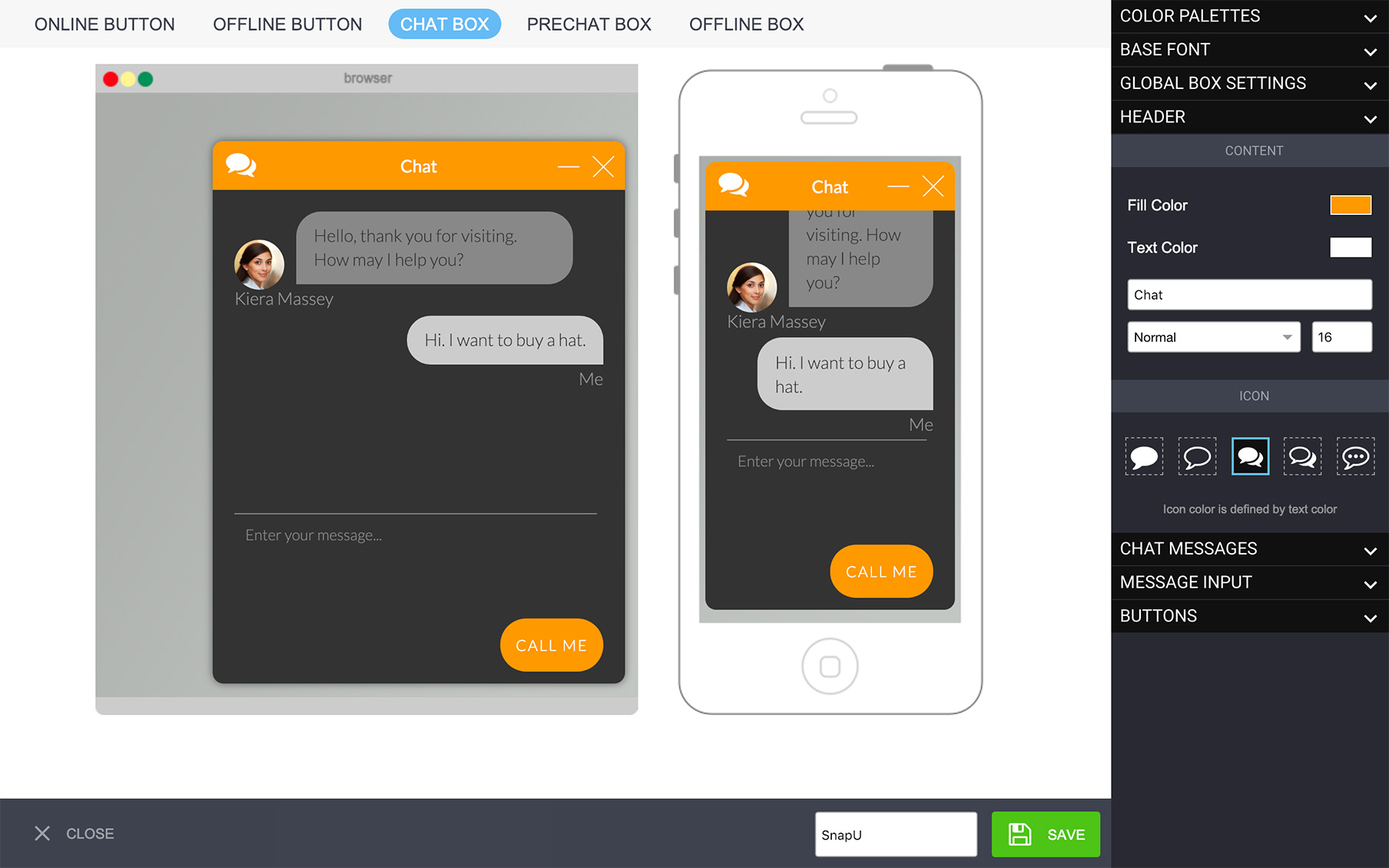
Choose the fill color of the header, the text color, the text, choose whether you want it normal or bold, and the font size, and also the chat icon for the header.
Chat Messages
You can choose the shape of the avatar, and select round, square or rounder corners (where you can select the amount of roundness)

Then, you can customize the chat text. Choose the agent chat fill and text color, as well as the visitor chat fill and text color. This reflects how the visitor will see the chat boxes. Also, choose the visitor name. The visitor will see the agent’s name, and then “Me” by default, but you can change this to something else.
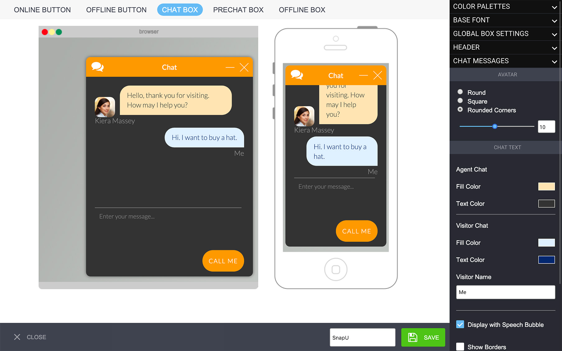
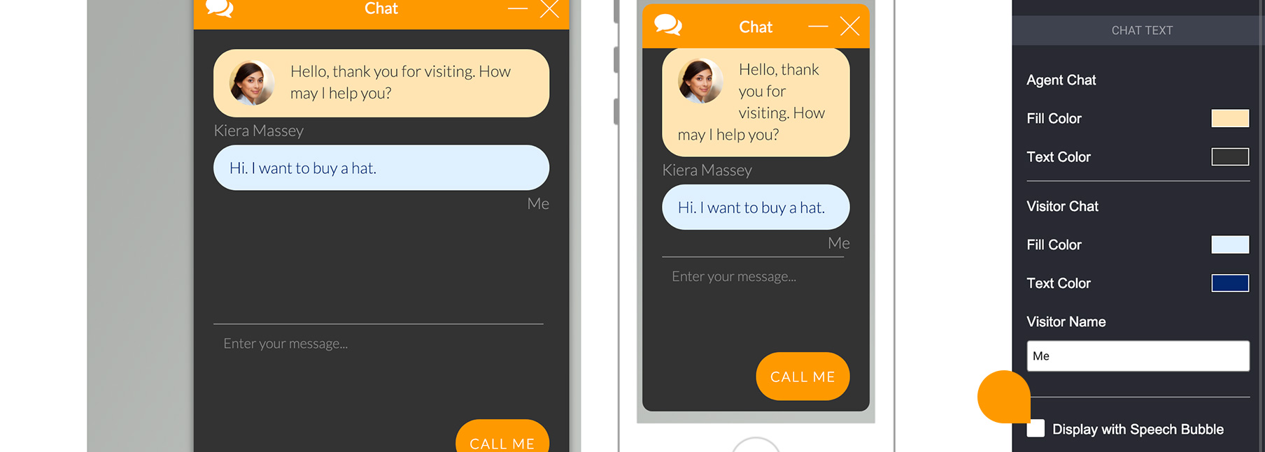
Finally, you can also choose whether you want the picture inside the speech bubble or outside.
Message Input
Here, you will be able to choose the settings for the message box, such as the fill color, the color of the text as it’s typed, and the color and content of the placeholder text (which is what says “Enter your message…”). You can also choose whether you want a border. You can choose the border’s color, thickness and if you want it to have rounded borders.
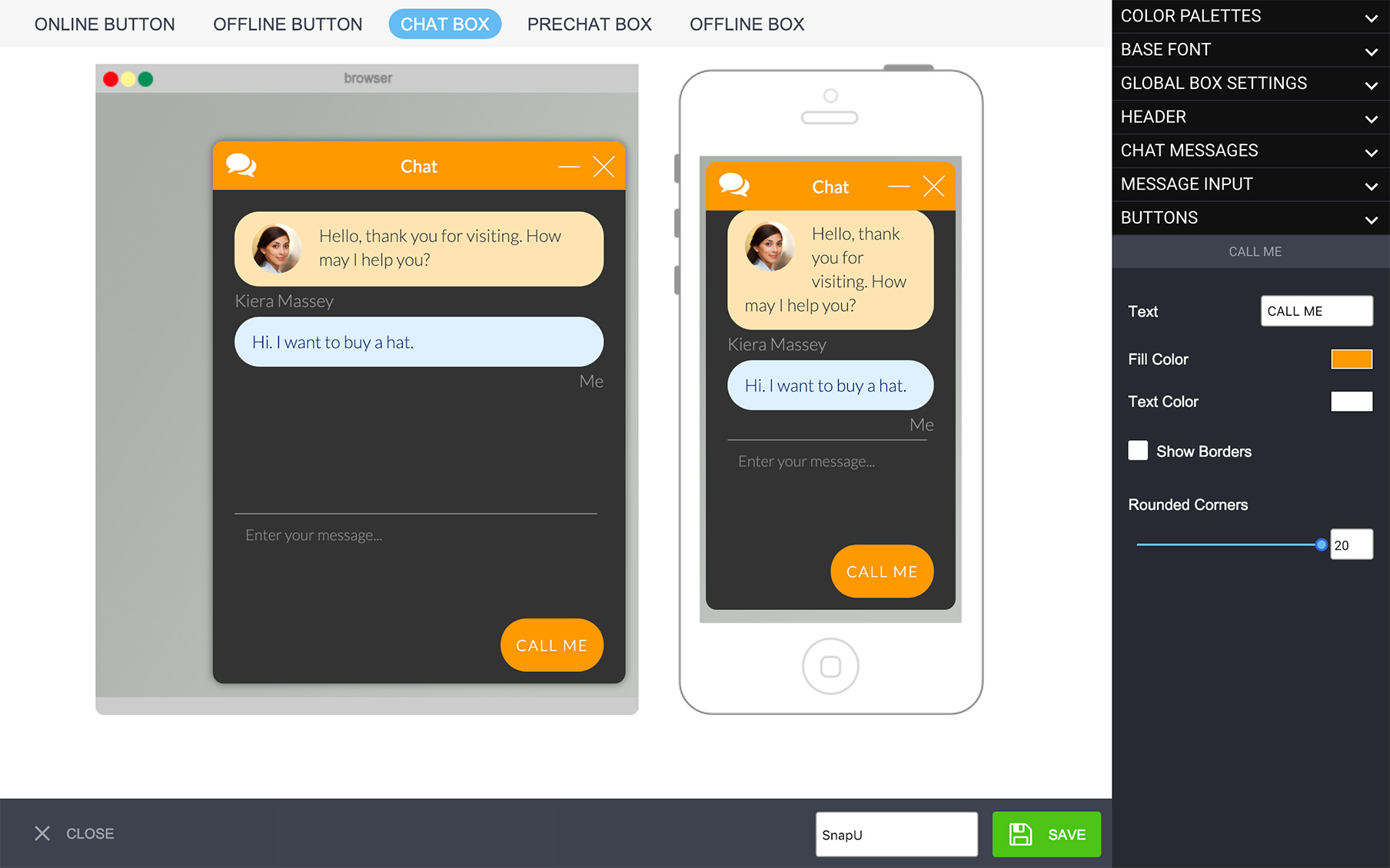
Call Me
You can choose the text for the Call me button, along with its color, the text color, and borders.
The button will only appear on your form if this feature is also enabled in the settings of your ‘Call Me’ tab, and the connected agent is set up with a number in the ‘Chat Agents’ tab.
Send Button
You can now add a Send button to the live chat window, to prevent possible confusion for your visitors!

To enable this, please go to Settings -> Design Studio -> “Edit” the currently applied theme and click “Save” when the Design Studio opens. You can edit the colour of this Send button icon by going to Settings -> Design Studio -> “Edit” the currently applied theme -> Chat Box -> Message Input.
———————————————————————————————————————————————|
PRE-CHAT BOX & OFFLINE BOX
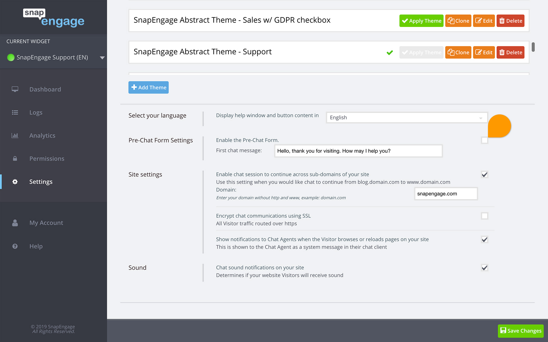
Here, you will be able to design what the pre-chat form looks like, but if you want it on, you will still need to activate it under the Design Studio settings :
For Base font and Global box settings and header, see Chatbox.
Field Design
Here, you will be able to select the background color for the fields, the text color (what you type inside the field), the label color (the text that describes the field) and the placeholder color (the text that shows inside the field before you type). You will also be able to add borders, choose the color, the width, and roundness of the corners.
Fields
With the Design Studio tool, you will be able to add fields to the pre-chat and offline forms. This will help you gather the data you want from your visitors, and you can select which fields are required. We do recommend to bear in mind that if you have too many fields (especially required), it may put some people off and they may go away.

The fields you will see on the design (left) are the fields under Active fields (right). You can drag and drop fields by clicking on the dots (see red rectangle on picture). You can add or remove the standard fields included. You can also click on the + sign, add a new field, and rename it. You can make fields required by clicking on the edit icon (once they are active). That’s also where you can change the label and placeholder texts, as well as delete the field. Please note the email field cannot be removed.
With this, you can also add a hyperlink, should you wish to do so, just add a “label text” field by grabbing it from the more fields section and dropping it onto the active fields section, then edit it, and add the html. For instance, if I want it to say “Visit our website” and link the SnapEngage website onto it, i would add the following html :
<a href="https://www.snapengage.com" target="_blank">Visit our website</a>
So what is between <a href= “ and “ target is the link you want the visitors to go to when they click. Where it says target=”_blank” this is so that the link opens on a new page.
You may also add colors onto the text by using html.

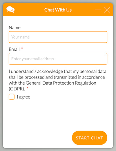
Another field you might want to use is Checkbox. If you are looking to add an agreement statement or are working with GDPR, you can add one in the Add More Fields section.
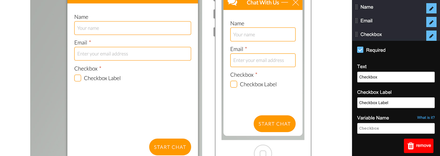
Here is an example.
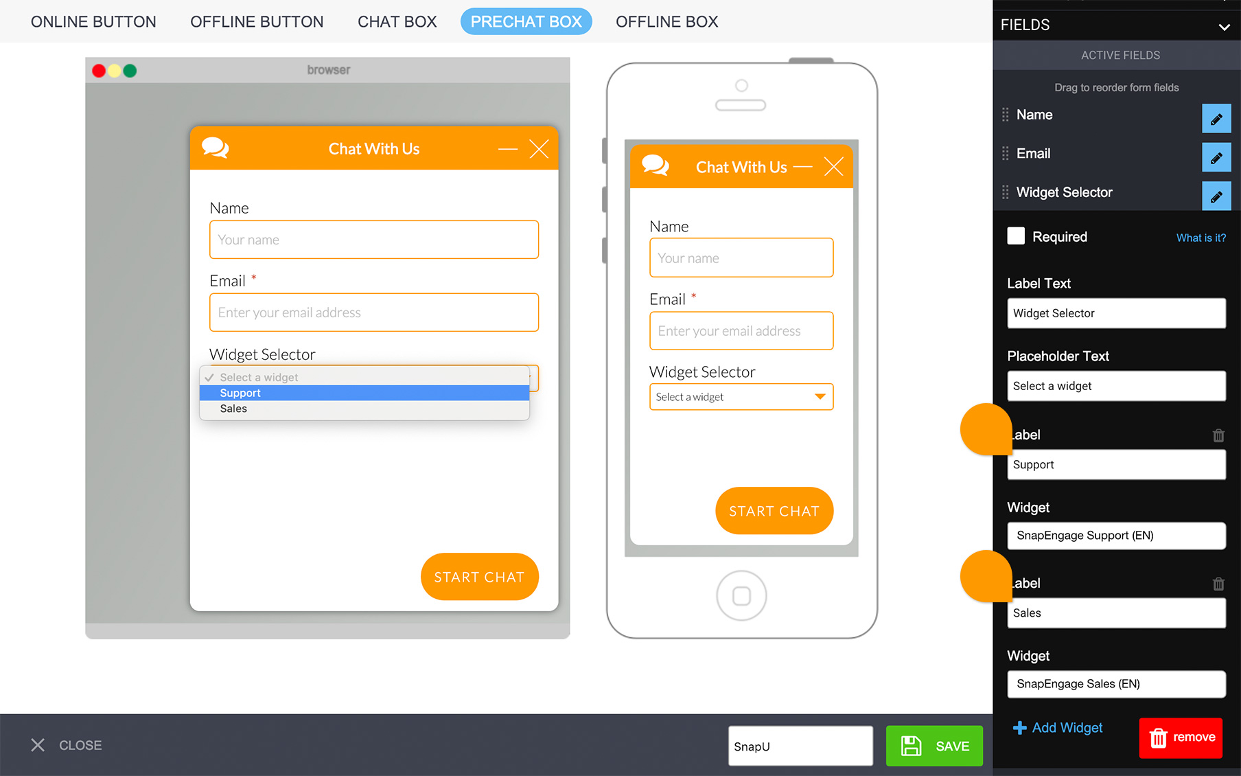
Widget Selector
You will find a more extended article here. If you have multiple widgets, you can now add a widget selector allowing your visitors to get routed to the right department.
Simply add the widget selector to your active fields, update the labels to reflect the name of each department and then choose the corresponding widgets. You will need to have at least 2 options. To add a widget to the list, click on the Add Widget option or to remove an option, just click on the tiny trash can.
*We recommend if you use this feature, that you require an email on both the pre-chat and offline form. The reason for this is because, if the system loads the pre-chat form for an online widget but a visitor selects offline widget, the form won’t change, but an “Email Us” button will be presented. So if you don’t require an email, then you won’t be able to get back to the visitor.
Buttons

Change the text of the button, the background color, the text color and add borders.
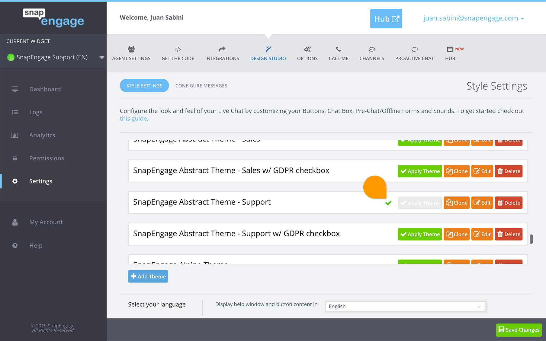
Now, make sure you save your design then proceed to close it, all that’s left afterwards is to apply it. A green arrow will point at the design being used.
Enjoy!
Published December 14, 2016


 (11 votes, average: 3.91 out of 5)